Thursday, September 3, 2009

A little Da Vinci jewelry

How about one of these to add a little sparkle into your home!

(source)

The Da Vinci chandelier from the Geometrix collection from Schonebek creates phenomenal drama and instantly becomes that star of any room. The sphere chandelier comes in many sizes, as well as sconce and lamp styles. There is also a LED option where you can create your own spectacular light show. And the best part is…this chandelier is dishwasher safe! Who would’ve ever thought they’d say that about a light in their home.

How are you adding sparkle to your home?

Thursday, August 20, 2009

Mirrors aren't just for your walls!

Gone are the days where your dining room wall is covered in floor to ceiling mirrors. These days mirrors are showing up in many locations around your home. There are the obvious locations in your bathrooms and dressing areas, or as artwork above your fireplace and in your front hall. But now mirrors are showing up as your furniture pieces. Many furniture designers out there are using mirrors to create modern and flashy pieces or using antique mirrors to create a twist on a classic piece. Check out and “reflect” on the variety of mirrored furniture pieces below.
A simple, clean lined desk from Mecox Gardens gives off a modern mirrored feel.
Antique mirrors on this piece from Century Furniture create a beautiful traditional chest ready for its place in your living room.
Drexel Heritage’s beautiful vanity desk with a three paneled mirror is a women’s dream for her dressing room.
Nancy Corzine’s Prism bed was inspired by the Chrysler Building!
This contemporary chest from Century Furniture is a bold addition to any room and has a great diamond pattern on its drawers. The next three images are of fantastic pieces from Horchow, which are great, cost effective options to be able to achieve the mirrored look without blowing the budget!

Mirrored furniture pieces are a great idea to add to your room to bring in a new level of sophistication. Mirrors can reflect other textures and colors in a room and create a new layer to your design.
Where is your favorite place to add a unique furniture piece?

Wednesday, June 24, 2009

Oh...to be a kid again!


Many of us have uttered this phrase often in our lives, whether it was when school was letting out for summer and the joy is plastered on school-aged children everywhere, or when you passed a playground and could hear the laughter and chatter of all the kids playing the day away while you trudge along to your office. Sigh….to be a kid again. Looking back at my childhood, I would love to be a kid again and redesign my bedroom…again! I was lucky, my parents let me decide what I wanted when it came time to redo my bedroom and what else came out of a girly third grader’s mouth, “I want pink!” Yes, my bedroom ended up being varying shades of pastel pink, and if I remember correctly the paint color was called little bo-peep pink and the carpet was bubble gum pink! If I could go back with even some of the knowledge I have now, my bedroom would’ve been something for a magazine. Now days parents are putting more into their children’s bedrooms, gone are the days where your nursery is either pastel pink or pastel blue, and gone are the days where they get you cartoon character bedding and call it good. Kid’s bedrooms now are well thought out to create fun and exciting spaces that a child and parent truly enjoy. Here are some fabulous children’s rooms… A tiger room for this little girl gives a touch of whimsy, without going over the top.
A chic twist on the classic yellow-pink scheme really pops in this nursery.
Pirates and sailors alike would enjoy this nautical themed room. It even has sails!
Blue, white and red are a great color scheme for this boys room and will continue to grow with the child.
Bold colors and patterns create a girly scheme any tween girl would love.
This camp themed room would be a treat for a boy or girl...anyone for a picnic?
The orange accents gives this teen boys room a pop against bright blue walls.
This great orange scheme is a fun and unique palette for a teen girl who doesn't want pink.

How was your childhood bedroom decorated? Or how are your kid’s room done? I’d love to hear from you!

Tuesday, June 16, 2009

DON'T BE AFRAID OF COLOR!

After seeing so many articles about all white or mainly neutral design palettes for a room, it was so refreshing to come across this article in this month’s Metropolitan Home magazine all about a home that wasn’t afraid to use color, bold color! Not that those white or neutral rooms aren’t amazing and chic on their own, but living in Minnesota where half the year we look outside and see no color, those palettes seem to just add to that late winter dreariness. Adding color into a design, especially in our region, helps ensure that your home will look lively and inviting no matter what time of year it is.
Check out some of the images from Metropolitan Home magazine’s article “A Home with Fearless Color”…

…or follow this link to see the entire article http://www.pointclickhome.com/decoration_inspiration/articles/home_fearless_color

Now don’t be afraid of color - liven up your home!

Wednesday, May 27, 2009

EASY ART

As you look around your own home, are you noticing a lot of blank walls? I will admit that my house has a few of them too. Art is a very personal addition to one’s home and at times a big investment. Soon though, those blank walls start to call out to you for something, anything to make them an attention grabber versus the wall you continually ignore. If this has become one of your design dilemmas and you haven’t had the time or budget to make a large investment in a new piece of art, here are a few simple ways to dress up your walls.

The painted canvas in this image was done by Nathan Thomas, last season’s winner on Bravo’s TV show ‘Top Design’. All it took was dripping/pouring paint colors down an upright canvas. How simple and chic is that!


Instead of a single piece, why not create a collage of images. Here simple black frames with white mattes are a fantastic way to display your favorite photographs. Printing the images in black and white creates a cohesive feeling among the various images. Try varying the frame sizes for an eclectic look.


Did you know you may have your own personal artist among your family? Take your child’s most recent artwork from school and forget about putting it on the refrigerator…put it up on your wall! It instantly becomes the most personal and sentimental piece of art in your home. You can even frame their art and easily change it out when a new drawing or painting comes home from school.


Now go do something fabulous with your empty walls!

Monday, May 18, 2009

LIVING OUTDOORS

With warm temperature in the forecast, I’m so excited to start “living” outdoors. Being that our warm weather season is so short, I, like many others I’m sure, am planning on spending as much time outside as possible! Outdoor living spaces are becoming increasingly popular, they are more than just a lawn chair on the patio, they are extensions of your indoor living spaces. People are creating entire “rooms” to relax in and enjoy nature's beauty.


Whether it’s a rooftop urban oasis, a cozy screened in porch or a simple furniture arrangement around a fire pit, there are many ways to make your outdoor living space a fantastic addition to your home. Here are some simple ideas to liven up your outdoor space…


Some seasonal pots to put lush greenery or wonderful fragrant flowers in…


Some cozy pillows that can be left out in the elements and still be beautiful…


Some great furniture ideas other than the old standard lawn chair…


Ways to light up your space…


And make sure you stay hydrated...


Now get outside and enjoy this gorgeous weather and your outdoor living spaces!

Tuesday, April 28, 2009

Taking Center Stage

A new trend is taking place, and it’s in our bathrooms. Gone are the times where our bathtubs are selected just for function and are tucked into a corners, tubs are now becoming the center of attention. They are now an important part of the entire design of a bathroom, something to not be forgotten.

Here a simple tub is accented with rich stone mosaic tiles, drawing the eye from the tub up the accent wall behind.

A great, sleek egg shaped tub stands out against the warm wood wall inviting you to come and relax while enjoying the view.
A classic claw-foot tub is offset with contemporary fixtures and finishes. A unique mix creating a space that doesn’t fall into one particular style.
Here a modern limestone tub with a crystal chandelier mounted above gives the feeling of rain falling and collecting in the tub below.
An exotic retreat is created with this free standing tub surrounded by Asian décor.
A luxurious spa feeling is immediately felt with this overflow tub and fabulous fireplace. Everyone say aaahhhh…..

Thursday, April 16, 2009

Goodbye Incandescent bulbs!


We all hear about it, changing out our incandescent light bulbs out to compact fluorescent will save energy. But many of us are not fans of compact fluorescent because of their color. They are not the warm light we are all used to; they tend to be a much bluer, colder light. Unfortunately our incandescent bulbs we all love will no longer be made come 2012. The energy billed that was passed in December of 2007 states that incandescent bulbs will be banned by 2014, the phase out will begin in 2012 with the 100 watt bulb and end with the 40 watt in 2014.

What will replace our incandescent bulbs? The compact fluorescent will be one option. This option uses about 75% less energy than an incandescent; it costs around $10, and has an average lifespan of about 6,000 hours. The lower amount of energy consumption and cost of the bulb per hour are the big advantages for using a CFL. However there are always disadvantages. CFLs contain small amounts of mercury which means special clean up if a bulb where to break and proper recycling should be done at the end of its life. Another major concern is the actual light; the color rendering is just not the same as our incandescent bulbs. It does take getting used to, but manufacturers know that this is a concern for many consumers.

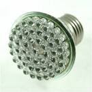
The second option to replace the incandescent bulb is LED bulbs. These are currently being used in car’s break lights, traffic signals, Christmas lights, under cabinet lights and recessed lights. Industry experts think that the LED will eventually replace CFLs. A low wattage LED bulb can produce the same amount of light as a 40 watt incandescent and produces little heat. It uses dramatically less energy than an incandescent, about 1/3 to 1/30th less! The average lifespan of a LED is around 50,000 hours, but the cost of the bulb tends to be high. Although the cost of the bulb is expensive, the costs are recouped over the lifespan of the bulb. Also, the industry is still working on producing a white LED bulb that can illuminate a space effectively which is why its currently only being used in spotlights/recessed lights.

Although the phase out isn’t for a few years consumers are already starting the transition from incandescent bulbs to CFL and LED bulbs. They are gradually changing bulbs as they burn out to the new options which give them the ability to spread the replacements costs out over time. Lighting fixture manufacturers are also making the change. Some companies already offer fixtures that use CFL or LED bulbs and all other companies are working on designing new fixtures to release to the market. We will still have great looking fixtures; they will just be more energy efficient. I think this is a step in the right direction to becoming more energy efficient even though I love my incandescent bulbs!

Tuesday, April 7, 2009

NW Suburban Remodeling Fair


Thank you to everyone that stopped by our booth this past weekend! It was great to meet and talk with so many people.
We hope to hear from you soon and get started on a project together!

Saturday, April 4, 2009

SPRING TREND IDEAS

Spring is finally here and after a long cold winter we all need ways to brighten up our homes. When I think of spring, I think of fresh spring colors, bright sunshine, flowers and trees in bloom and birds chirping in the trees. Once the spring fever hits and we’ve all done our spring cleaning, there are many ways to bring the new season into our homes. If you’re looking for a big change, try painting a room in a great green or yellow spring hue like SW6693 Lily, SW 6708 Springtime, or BM 764 Crystal Springs.

Accessories are always a great way to bring color and the current season into a home, check out the local retailers for new accent pillows, a colorful vase, some new table linens or even a colorful candle.

The easiest way to freshen up your home is to bring in fresh cut flowers. Both the added aroma and color will brighten any empty table or corner and gives that particular space a warm and welcoming feel. Some great spring flowers to add would be daffodils, daisies or tulips. Pairing the tulips with a modern square vase will give you a unique twist on a classic flower.

Check back Monday for the first weekly post!! Have a great weekend!

Wednesday, April 1, 2009

COLOR TRENDS FOR 2009!

Just like in fashion and technology, interiors trends change slightly from year to year. Every year the major players in the paint industry release their color forecasts for the upcoming year. They look for inspiration in many different places; sometimes the inspiration for a new color can come from the most unusual place. Such as different cities around the world (St. Petersburg, Buenos Ares), local farmers markets, or the newest technology gadget. Here is what they’re saying for ‘09
Nuetrals
This year’s neutrals are drawn from raw materials and the environment. They’re inspired from wood, stone, natural fibers, concrete and even steel. See SW6148 Wool Skein, BM AF-95 hush, SW7504 Keystone gray, BM 1591 sterling, SW6146 umber, and BM2121-20 steel wool

Yellows and Greens
The “sunny” yellow shades are still around for this palette, and the bright greenish-yellows are still popular. The greens are tending to move more to a grayer tone and with some blue infused in them. See SW6901 daffodil, SW6690 gambol gold, BM 370 yellow tone, SW6404 grandiose, BM 495 hillside green, SW0060 alexandrite

Reds and Oranges
Red gets a little hint of orange pulled from tropical fruits and flowers. Pink/coral is brought back with hints of orange and gray tones to give a fresh feel of sophistication. Orange has moved away from the bright shades and is now more restrained. See SW6600 enticing red, BM 1342 mardi gras, SW6325 constant coral, SW6023 insightful rose, BM 2158-10 dried mustard

Blue and Violet
Blue continues to be in the color forefront stemming from the natural inspiration of water. Violets and plums also continue into this year, although they have more of a red influence than before. See BM AF-625 aplomb, SW6558 plummy, SW6808 celestial, BM AF-500 atmospheric, SW6804 dignity blue

Don’t be afraid to step outside the box, make your own statement with color. Chose contrasting bold colors and toss a third lighter color in to create an unexpected but personal statement!


Check out www.sherwin-williams.com or www.benjaminmoore.com to see this colors.